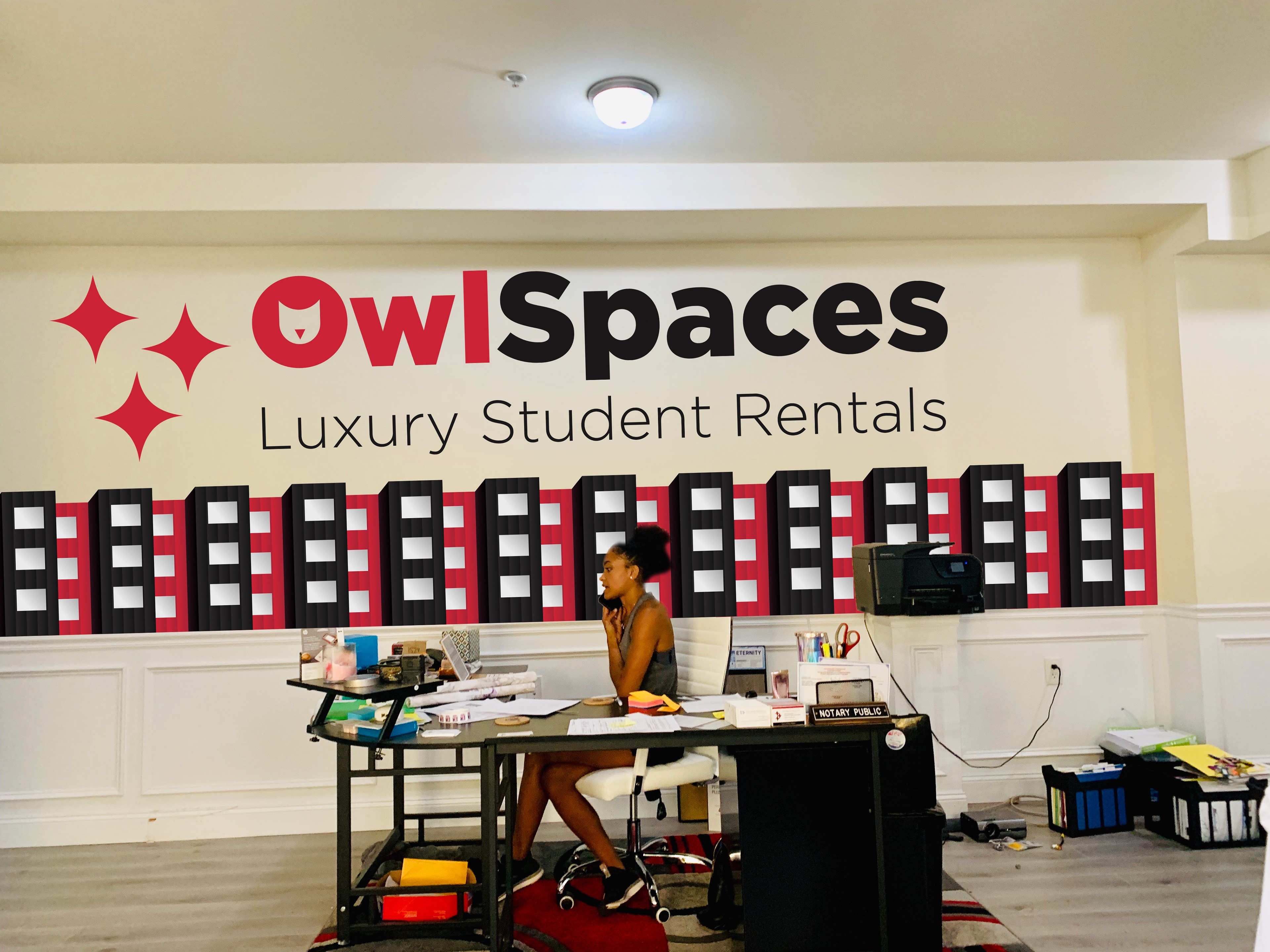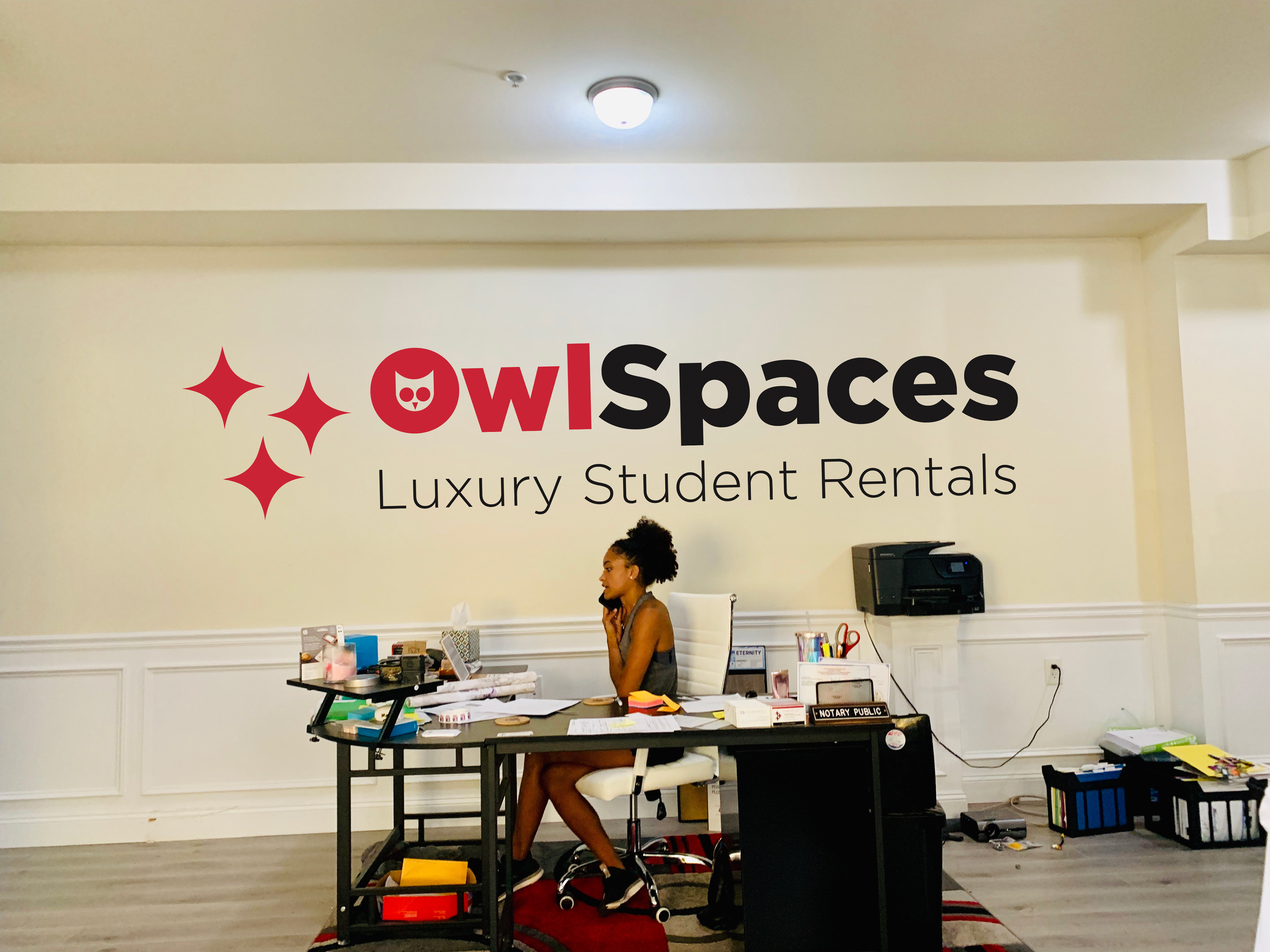
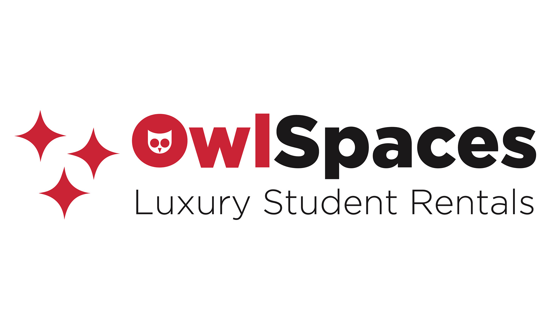
Owl Spaces is a growing property manager in Philadelphia who wanted to update their logo and have it painted onto their wall right over the front desk in order to help create a more professional image for their office.
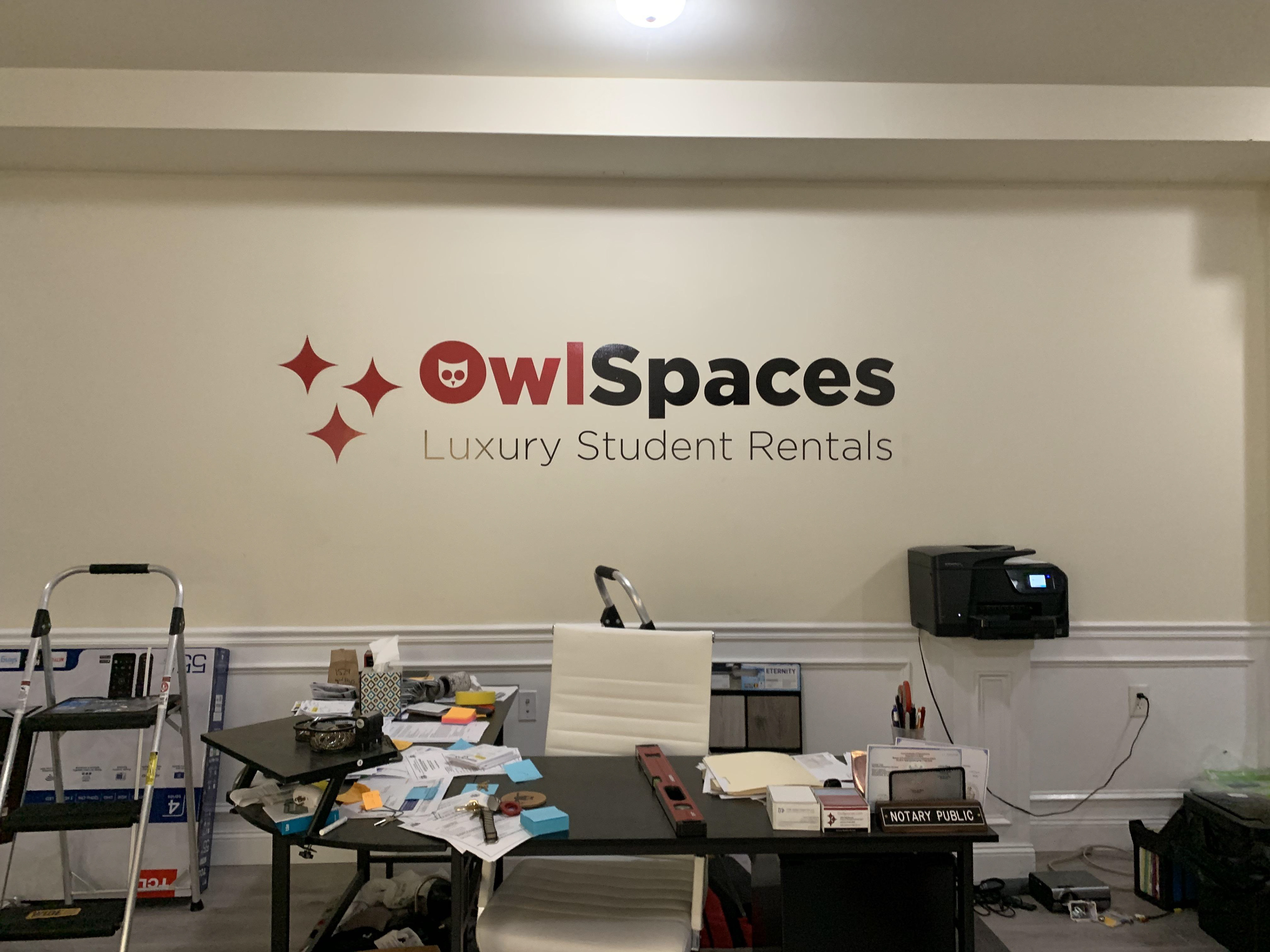
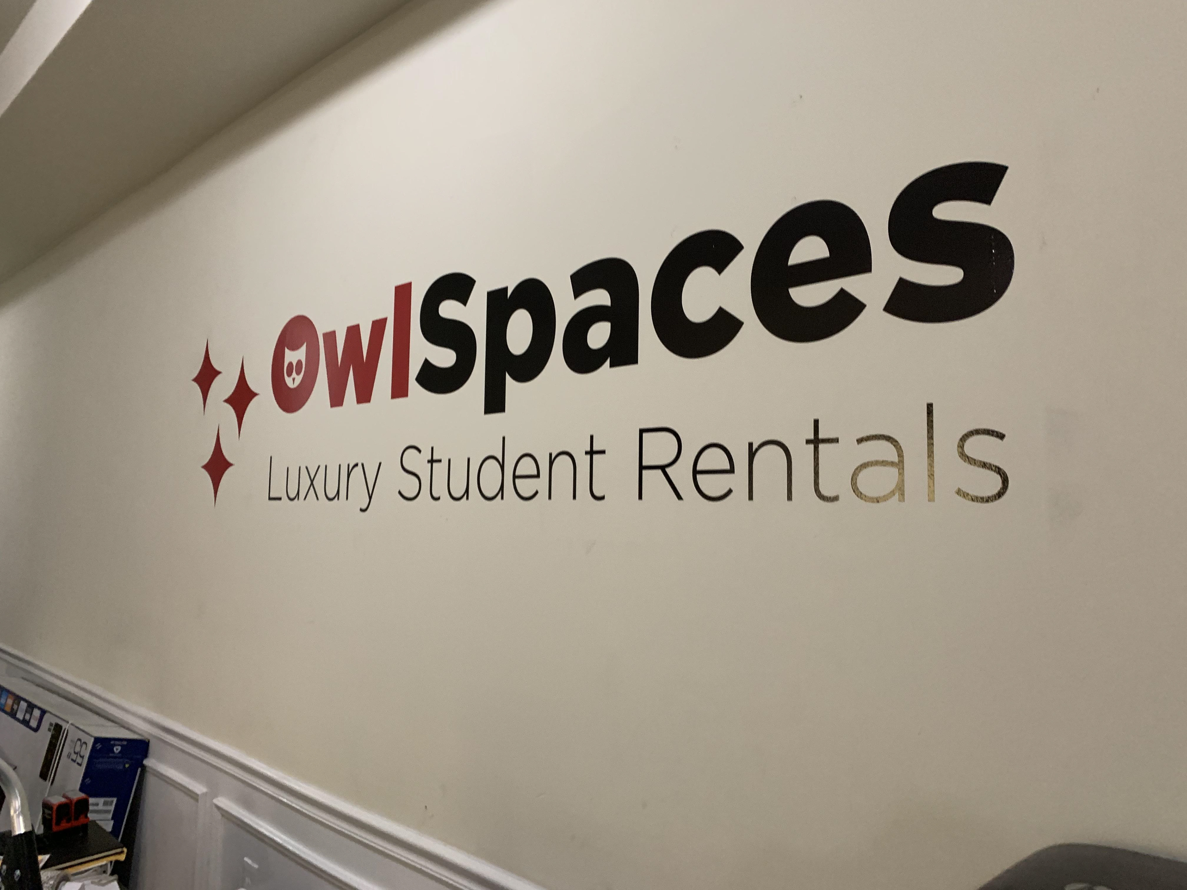
Owl Spaces focuses primarily on temple student housing so I kept the colors to the traditional cherry and white as they had in their original logo. I then updated the fonts by balancing the weights and sizing of the type.
I saw an opportunity to use the negative space of the O and made a simple owl icon to connect the logo to Temple more.